As interior design continues to move toward natural influences, deep warm autumn color palettes are emerging as one of the defining living room trends of 2025.
This guide explores the most sought-after deep warm tones for 2025, including terracotta, aubergine, and layered neutrals inspired by nature. It outlines practical ways to combine these colors to create a cozy, well-balanced living room, with clear guidance on furniture choices, decorative accents, and lighting solutions that enhance warmth without overwhelming the space.
1. Why Deep Autumn Colors Are Dominating 2025
A Return to Nature and Authenticity
In 2025, interior design continues to move toward spaces that prioritize comfort, emotional warmth, and a sense of natural connection. Bright whites and high-contrast interiors are gradually giving way to softer, warmer hues that feel more inviting and lived-in. This shift reflects a broader preference for interiors that support everyday comfort rather than visual minimalism alone.
As a result, deep autumn color palettes are gaining renewed relevance. Earth-inspired shades bring a grounded, organic quality to living spaces, helping interiors feel cohesive, calming, and rooted in the natural environment rather than overly stylized or transient.

Autumn Home Finds
Psychological Impact of Warm Earth Tones
Warm earth tones such as sienna, camel, chocolate brown, and olive are widely associated with feelings of stability, comfort, and emotional balance. In interior spaces, these shades tend to reduce visual tension and create an atmosphere that feels grounded and reassuring.
As deeper, more saturated colors become more common in contemporary design, palettes built around auburn, olive green, and softened plum tones are increasingly linked to interiors that prioritize well-being and long-term comfort rather than short-lived trends.
These colors are often used to add depth to living rooms through upholstered furniture, layered textiles, or accent walls, helping spaces feel more enveloping and intentional. The result is an environment that supports relaxation and everyday living while still maintaining a refined, design-forward appearance.
2. Building a Warm Autumn Palette: Core Hues and How to Use Them

Base Neutrals: Begin with soft camel beige, sandstone taupe, or muted ochre. These shades perform the role traditionally filled by white or light gray but introduce greater warmth and visual depth. They work well on walls, large upholstered pieces, and flooring, forming a calm foundation for richer colors.
Mid-Tone Warmth: Layer in terracotta, rust, cinnamon, and leather brown to create contrast without overwhelming the space. These tones are commonly used in sofas, armchairs, area rugs, or window treatments, adding a cozy, grounded feel that supports a relaxed living room atmosphere.
Accent Colors: Deep olive green, aubergine, mustard yellow, or dark teal introduce character and visual interest. Applied sparingly through cushions, artwork, or accent furniture, these colors prevent the palette from feeling flat while maintaining cohesion.
Metallic Highlights: Brushed brass, antique copper, and soft gold finishes enhance warmth and add a refined touch. Lighting fixtures, hardware, and decorative accessories are effective ways to introduce metallic elements without dominating the overall scheme.
Textural Contrast: Balance color with texture by combining matte wall finishes or microcement surfaces with velvet, bouclé, leather, and natural wood. This mix creates depth and prevents warm palettes from appearing heavy.

Test paint samples at different times of day before finalizing a color choice. Warm tones often react strongly to changes in natural and artificial lighting and may appear noticeably darker or more saturated in low-light conditions.
3. Living Room Styling: Expert Tips to Nail the Fall Palette

Accent Walls with Visual Impact
A single feature wall in a deep autumn shade such as cinnamon brown or muted plum can anchor the living room and introduce warmth without overwhelming the space. Positioned behind a sofa or fireplace, this approach creates a natural focal point while allowing lighter furniture and decor to maintain visual balance.
Layered Textiles for Depth and Comfort
Textiles play a key role in reinforcing warm color palettes. Velvet cushions in burnt orange or olive, wool throws in soft gray tones, and layered rugs such as jute paired with a plush brown surface add dimension and comfort. In cohesive interiors, texture often has a greater impact than pattern.
Mixing Metals for Refined Contrast
Combining warm metals such as brass, copper, and bronze introduces subtle contrast and polish. Picture frames, lighting fixtures, and decorative accents are effective placements for metallic finishes, supporting a layered look that feels rich without appearing excessive.

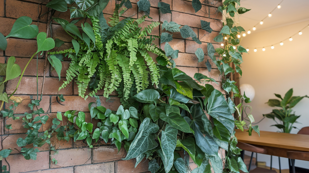
Add Living Greenery
Incorporating indoor plants is an effective way to balance warm autumn tones and introduce a natural element into the living room. Oversized potted plants such as fiddle-leaf figs or eucalyptus add height and visual contrast, while deep green foliage complements earthy color palettes and reinforces a connection to the outdoors.
Statement Lighting
Lighting plays a central role in defining atmosphere and functionality. Oversized drum pendants, amber glass table lamps, and sculptural fixtures in terracotta-inspired finishes add warmth and visual interest.
When combined with recessed lighting or subtle LED accent strips, this layered approach allows the space to shift easily between everyday use and a more relaxed evening ambiance.
4. Smart Updates for a Budget-Friendly Refresh

Paint and Textile Updates: Retaining existing furniture while refreshing accent walls and soft furnishings is one of the most cost-effective ways to introduce an autumn-inspired palette. Repainting a single wall and replacing pillows or throws with deeper seasonal tones can significantly change the mood of a living room without requiring major investment.
Secondhand Wood Pieces: Pre-owned side tables, benches, or vintage armchairs often provide a strong base for updates. A warm brown stain or a leather seat cushion can enhance their character and help them blend seamlessly into a rich, earthy color scheme.
Seasonal Decorative Greenery: High-quality faux foliage and dried floral arrangements offer an easy way to introduce autumn colors on a seasonal basis. Elements such as oak leaves, branches, or dried grasses add texture and warmth while requiring minimal upkeep.
Refinished Accessories: Small accessories can have an outsized visual impact. Picture frames, vases, and decorative objects can be refinished in copper or champagne-toned metallics to create a more polished look without the cost of new pieces.
Peel-and-Stick Surface Treatments: Peel-and-stick tiles in terracotta or warm amber tones provide a practical option for updating backsplashes or accent areas. These materials offer the appearance of a permanent finish while remaining accessible for renters or short-term design updates.
5. 2025 Interiors: What’s Next

Color Drenching: Full-room color saturation is gaining momentum in 2025 interiors. Using a single deep autumn hue across walls, ceilings, and trim creates an immersive atmosphere that feels intentional and cohesive, particularly in living rooms designed for relaxation.
Biophilic Balance: Warm color palettes are increasingly paired with natural elements to reinforce a connection to the outdoors. Indoor greenery, stone feature walls, and natural finishes help balance richer tones and contribute to interiors that feel grounded and harmonious.

Sustainable Design Choices: Environmental considerations continue to influence interior design decisions. Low-emission paints, reclaimed wood furniture, and energy-efficient lighting support a more responsible approach while complementing earthy color schemes and natural materials.
Layered Texture Within a Monochrome Palette: When working with a limited color range, texture becomes essential. Combining matte stone surfaces, soft velvet upholstery, and raw or lightly finished wood prevents interiors from appearing flat while maintaining a cohesive, monochromatic look.
How to Make Your Home Extra Cozy This Autumn

As daylight hours shorten and temperatures decline, designing a home that feels warm and inviting becomes a key priority. Even in compact apartments or larger residences, a few carefully selected updates can quickly enhance comfort and create a welcoming atmosphere for the season.
1. Layer Lighting for Mood and Function
Replace harsh white bulbs with warm LEDs or Edison-style lighting to create a softer, more inviting glow. Incorporate floor lamps, string lights, and candles to build layers of illumination that balance function and atmosphere. In autumn interiors, prioritizing golden, warm light enhances comfort and sets a cozy, welcoming tone throughout the space.
2. Mix Textures Generously

Combine a variety of materials such as knit blankets, velvet cushions, faux fur throws, and chunky wool rugs to create a layered, tactile interior. Including multiple textures adds depth and a sense of comfort, while natural fabrics like linen and cotton help balance the richness of the palette and maintain a relaxed, inviting atmosphere.
3. Incorporate Earthy Scents
Fragrance plays a key role in shaping the atmosphere of a home. Essential oil diffusers or candles in seasonal scents such as cinnamon, cedarwood, clove, pumpkin spice, or apple can subtly enhance comfort. These warm, natural aromas create an inviting environment that complements autumn-inspired interiors.
4. Create Seasonal Nooks

Designate a small space for relaxation, such as a window seat with a plush cushion, soft throw, and a selection of books or journals. Autumn encourages slower, more intentional living, and having a dedicated nook supports quiet moments and personal rituals.
5. Switch to Autumnal Colors
Incorporating deep, warm tones can instantly bring a seasonal feel to any space. Small updates such as rust-colored pillow covers, ochre throws, or dark green kitchen linens create a cohesive autumnal palette, subtly transforming the mood of the home while maintaining a natural, inviting atmosphere.

6. Bring the Outdoors In
Incorporate natural elements such as dried flowers, pinecones, wooden trays, or seasonal produce like pumpkins and gourds to introduce an organic, autumnal feel. These accents create a subtle connection to nature, enhancing warmth and bringing a rustic, seasonal character to interior spaces.
7. Reorganize for Calm
Clutter can disrupt the sense of comfort during cooler months. Evaluate surfaces and storage, keeping only items that add warmth or joy, such as favorite mugs, cozy books, or seasonal artwork. A well-organized space enhances tranquility and supports a relaxed, inviting atmosphere.

By applying these autumn-inspired decor strategies, interiors can align with 2025 design trends while fostering a comfortable, welcoming environment. Thoughtful touches create a space that encourages relaxation, seasonal enjoyment, and a sense of calm throughout the home.
Mistakes to Avoid with Deep Autumn Palettes
Deep autumn color schemes can add warmth, depth, and sophistication to a home, but certain missteps can compromise their intended effect. Drawing on observed trends and practical design experience, the following are common pitfalls to avoid when incorporating rich, warm tones into interiors:
1. Overloading the Space with Dark Tones
Using deep shades such as burgundy, rust, or forest green across walls, furniture, and decor at the same time can overwhelm a room. Excessive dark elements may create a heavy or confined feeling. Balancing these rich tones with lighter neutrals like warm beige, ivory, or soft taupe helps maintain a cozy atmosphere while keeping the space visually open.
2. Neglecting Lighting Conditions
Proper lighting is essential when incorporating deep autumn hues. Without sufficient natural or layered artificial light, interiors can appear flat or gloomy. Assess how light interacts with the space throughout the day, and consider adding warm white bulbs, wall sconces, or reflective surfaces such as mirrors to enhance brightness and highlight the richness of the palette.

3. Using Cold Undertones
A common mistake in decorating with deep autumn palettes is combining rich warm hues with cooler shades such as icy gray or blue, which can create visual tension. To maintain harmony, pair autumn tones with earth-based neutrals and accents in golden, copper, or terracotta shades, reinforcing a cohesive and inviting atmosphere.
4. Forgetting Texture and Layering
Deep colors reach their full potential when paired with varied textures. Velvet cushions, wool throws, woven rugs, and natural wood finishes add depth and tactile interest, preventing the space from feeling flat. Layering materials creates a warm, inviting, and lived-in atmosphere.

5. Choosing the Wrong Accent Colors
Accent colors should support the primary palette rather than compete with it. Bright neon tones or stark white can disrupt the warm, grounded atmosphere typical of autumn-inspired interiors. Subtle highlights in soft gold, muted blush, olive, or ochre harmonize with rich fall shades while adding depth and visual interest.
FAQ: Deep Warm Autumn Color Palettes for The Living Room
Q: What are the key colors in a deep warm autumn palette?
A: Core shades include terracotta, rust orange, deep plum, burnt sienna, mustard yellow, boysenberry, chestnut brown, and carnelian. These rich, earthy tones bring warmth and a cozy atmosphere to living spaces. Complementary hues from the broader autumn palette can be layered for depth and variation, creating a balanced and inviting interior for the season.

Q: How can dark tones be balanced to prevent a room from feeling heavy?
A: Apply deep shades as accents on items such as cushions, vases, or decorative objects, and pair them with lighter neutrals like cream, ivory, or pale wood. This combination preserves warmth while keeping the space visually open and inviting.
Q: Is it possible to incorporate warm autumn colors into minimalist decor?
A: Yes. Minimalist interiors gain depth and comfort from warm tones. Focus on one or two strong shades and introduce them through texture-rich elements such as woven baskets, rugs, or ceramic pieces to maintain simplicity without sacrificing coziness.
Q: Are deep warm tones suitable for small living rooms?
A: They can be highly effective if used thoughtfully. Instead of applying dark shades to every wall, consider a single accent wall or incorporating deep tones through accessories to create a cozy focal point without overwhelming the space.
Q: Which materials complement autumn color palettes?
A: Natural and tactile materials enhance warm autumn tones. Linen, velvet, wool, jute, wood, matte ceramics, and brushed brass finishes all work well, adding depth, texture, and a grounded, seasonal feel to interiors.
This article may contain affiliate links. If you make a purchase through these links, I may earn a small commission at no extra cost to you. Thank you for supporting the blog!